Screaming Eagles
I was working up some logo concepts for a client that thought they needed an eagle and a globe in their identity. These were a couple concepts that while they were completely wrong for this particular client, turned out okay. Maybe they will make a cool t-shirt someday. . .

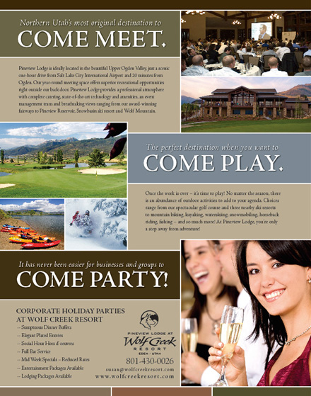
Wolf Creek Pineview Lodge Ad
This is an ad I designed for Wolf Creek’s new corporate event and meeting space, Pineview Lodge. It will be running in an upcoming issue of Utah Business Magazine.
Free Fonts
Here is a link sent to me by my friend Greg with some free fonts. Can’t beat that price!
http://www.misprintedtype.com/v3/fonts.php
Create a halftone-dot effect in Adobe Illustrator
This is a link to a nice tutorial on a vector based halftone-dot effect. I thought it might come in handy for someone down the road.
http://www.jdempsey.com/create-a-halftone-dot-effect-in-adobe-illustrator/
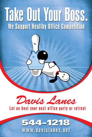
Davis Lanes Posters
I have been bowling at Davis Lanes in Layton since I could barely hold a bowling ball. Never in a million years did I ever think they would call FORTHGEAR and ask us to do a project and never in a million years did I ever think they would ever approve the budget and actually go through with a project. While small in scope, we had a lot of fun brainstorming and producing these posters. I got a lot of good support in their development from the great team at FORTHGEAR. They will be going up in their new movie style backlit display that they have installed. Enjoy.

Youth Conference Shirt
this is a shirt and logo I have designed for our church’s youth conference this september. The theme is One Heart. One Mind.
there was a lot of debate about what colors we should use for both the shirt and the print red on the ash grey were not my first choice but ended up the politically acceptable compromise.

Referendum 1 Diagram
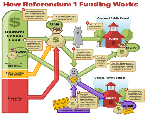
This is a complex illustration I have been working on for one of my clients that is lobbying to get Referendum 1 passed by popular vote here in Utah come November’s election. I guess some state officials are still confused about how the program is going to be funded so they had me work up this diagram. As you can see public education funding is pretty complex. I have to credit my associate Josh for coming up for the original look and feel for the Illustration. I had the fun job of taking the clients sketch and making it make sense…
Wolf Creek Ad
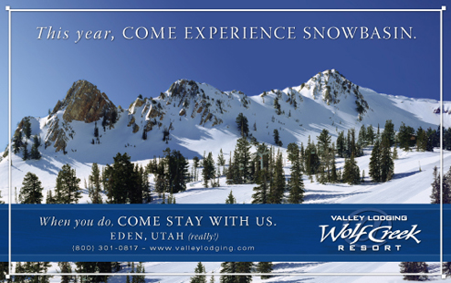
I just finished up a half page ad that will run in SKI magazine’s november issue inside of a SkiUtah advertising insert. It is one of the simpler ads I have done for them. They tend to want to always write a novel but this time we kept the message simple and focused. I hope it works out for them.
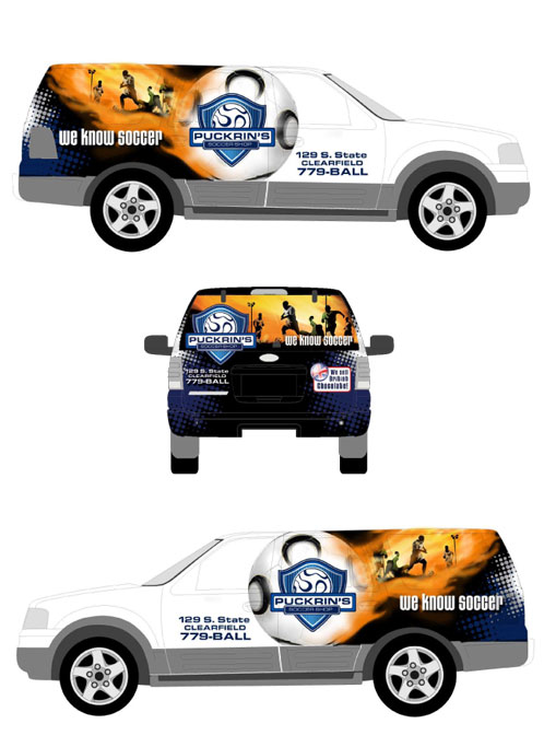
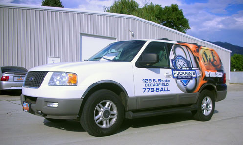
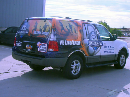
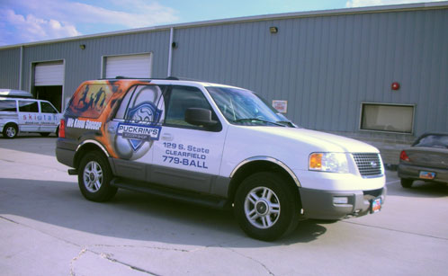
Puckrin’s Soccer Shop Vehicle Wrap
I had the priviledge of designing a vehicle wrap for a small soccer shop here in Davis County. I have been asked a couple times of late what I enjoy most about being a graphic designer and while I still think logo development is still my favorite project, I do enjoy the challenge and change of pace that is large format design, particularly vehicle wraps. I think I have designed and produced at least five full wraps in my time and each is a unique challenge depending on the make and model of the vehicle. You not only have to create a design that works much like a billboard but you also have to take into account the contours of the vehicle, avoid placing important information over deep contours such as door handles and such and also have to deal with making sure the wrap is visually stunning to boot. Below is the concept art followed by three prictures from the shop to show you how well the concept translates into printed and applied graphics.
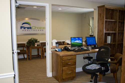
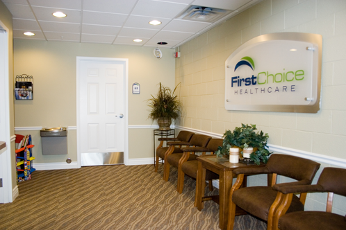
First Choice Signage
I have been feverishly working with one of my larger clients on the branding for a new medical clinic they are opening. We started developing the logo almost eight months ago and now the first clinic is opening up next week. I have been envloved in everything from the style and usage guidlines to the design of the clinic’s website and stationery system. One of the funnest projects was developing the environmental graphics for the clinic including the large lobby sign you see in the images below. With the help of one of my favorite vendors, fusion imaging we created a standoff sign that incorporates a brushed illuminium standoff and a layer of plexiglass with the logo printed on it. The plexi is finished with a semi-translucent pearl-essence that really creates a nice effect. This has been an incredibly stressful project but once the signage was installed it was amazing to see the instant effect it had on legitimizing the interior of the space.