Farmington Festival Days
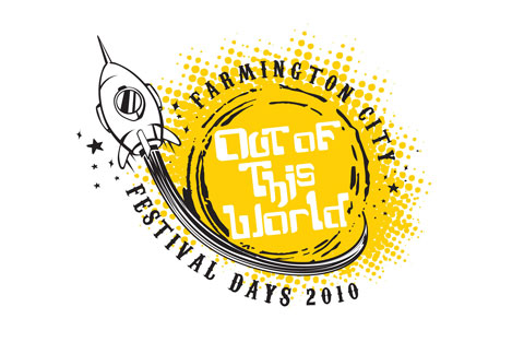
For the third year in a row I have been asked to develop the identity for the Farmington City Festival Days. I’ll admit I was not a huge fan of the theme this year and really struggled with what to do. It was hard to think of a concept that I would personally relate to and if they put it on a shirt (which they always do) would want to wear. I finally came up with the logo below. It works. Heck of a lot better than the obscure Fiesta / dancing theme from the first year.
Poster Design
This is a Poster Concept I developed for an upcoming concert series in our area. I’ve tried typographic solutions for them for three straight years and every year I get a “love it…but.” I was determined to nail something that was typographic and yet resonated with their target audience. I think this might be the year… I’ll let you know.
Nature Jim’s Logo Development
here are some process views of a logo I’ve been working on. Below are some of the conceptual ideas we presented to the client. As with any presentation my goal is to present a wide array of options for the client to choose from. I try to avoid logos that are similar to each other. In some cases this can be a challenge, especially if the company name is very descriptive in and of itself. In this case, Nature Jim’s left us open to explore a variety of styles and I think the presentation came together very well from a variety of possible solutions standpoint.
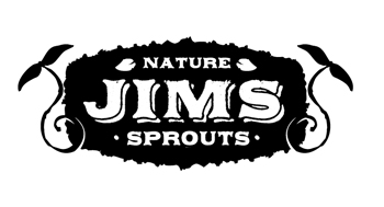
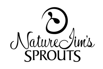
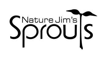
I was very fond of the first one. The client ended up selecting the last one with some slight improvements. I will post the final version and some brand image collateral soon.
Ambigram
It has been months since I’ve posted anything to my blog. I have a whole archive of stuff I’ve wanted to post but time has been a commodity these past view months as I’ve tried to balance a growing family and working through a tough economy. 2010 has started off strong and I’m anxious to getting back into the habit of posting more regularly – no promises though.
Below is a logo I worked on last year that was quite fun. I loved Dan Browns book Angels and Demon’s and had always wanted to try my hand at an ambigram. MacKay Clark, our summer intern had a nice ambigram in his student portfolio and the right project came along shortly thereafter so and amazingly we got it to work and the client loved the idea. Call it a perfect storm.
More Illustration Work
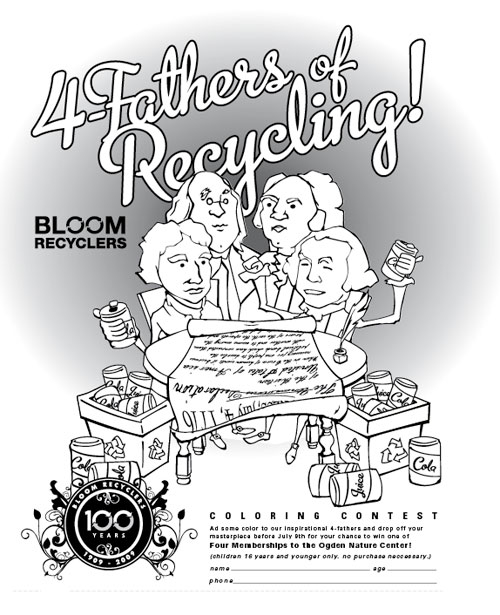
This summer i’ve had the chance to collaborate with a couple fellow designers on some fun spot illustrations for a client of ours up in Ogden. The first was a concept we pitched as part of a larger campaign as part of the week after the 4th of July. I worked closely with our intern for the summer from Utah State MacKay Clark. He’s a very talented young artist and it was fun to see him grasp the concept and put a fun spin on the idea.
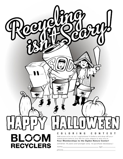
The second was also a very colaborative piece between myself and Erik DeWall. In fact, it was Erik’s concept and original sketch that fueled the idea so most of the credit goes to him. These pieces have both been fun to work closely with a few of the other designers at Forthgear on a complex illustration. I learn little things each time as I watch their processes.
Commissioned Illustration
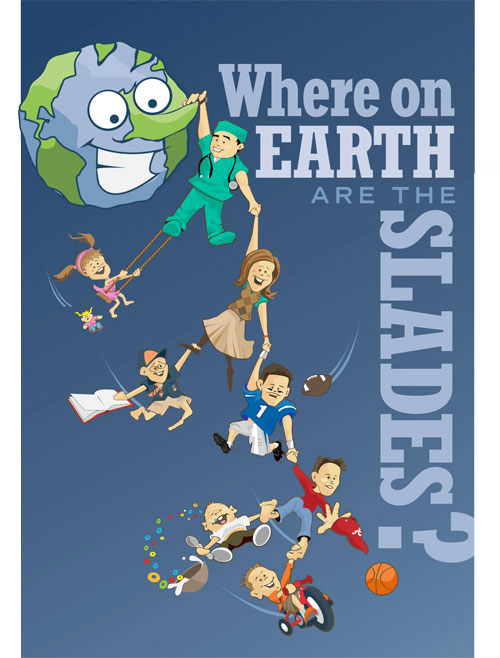
It’s not often enough that I get free creative reign on an illustration piece so I jumped at the chance to do this fun, off the wall illustration for some family friends. It was a blast and I hope to do more in the future. Thanks to Sarah Slade and her family for being incredibly patient and great sports!
2012 Packaging Progress
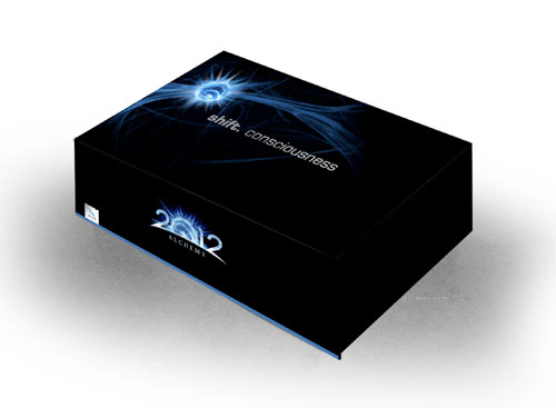
It’s taken a couple months but we are finally making some serious progress on the 2012 brand starting with labels and the box. below is the concept rendering of the concept art. both the labels and the box are going into production this month so I hope to be able to post actual product shots very soon.
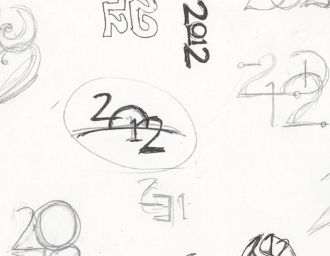
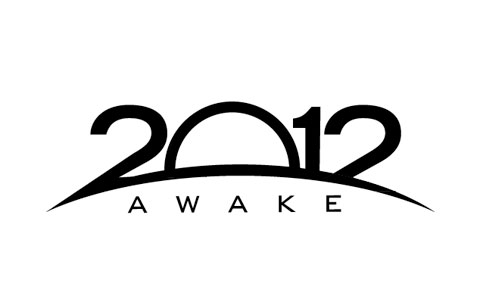
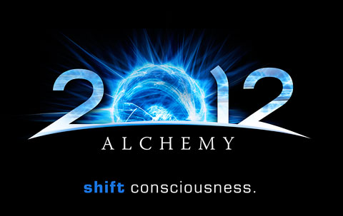
Process: 2012
I had the opportunity to work up a product identity for a new health supplement coming on the market. I love the process of design. Discovering unexpected results and seeing how things evolve from a simple sketch into something extraordinary. The development process of this logo identity is one of those where I would never have guessed we would end up where we did but I can see glimpses of greatness throughout the process. Let me know what you think.
Step 1: Sketches. This sketch was not one of my favorites but we saw something and moved it on to be digitized.
Step 2: We went into initial presentation with this version. I loved the way the concept had evolved from the sketch. I think the metaphor is appropriate to what their product is offering and the way things came together were definitely strengthened over the original sketch
Step 3: The client thought the idea was close but challenged us to take it beyond anything we had done to that point. He showed us some relevant source material and we took it to a new level.

