Farmington Parks & Rec Logo Development
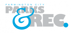
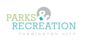
Just finalized the logo for Farmington City after many months of contemplation. It was a project that started with what I felt was a lot of good energy and momentum and then fizzled out for a good 4-5 months until they settled on the typographic variation above. As I look back on it now, with a more objective eye, I think they made a good choice stripping out the iconography and going with a very simple yet sophisticated type only identity. I hope it will serve them well for a very long time.
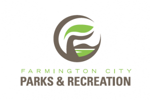
Below are some of the concepts from the original presentation.

This entry was posted on Saturday, December 11th, 2010 at 10:33 pm and is filed under Uncategorized. You can follow any responses to this entry through the RSS 2.0 feed. You can leave a response, or trackback from your own site.