TalentStar Identity Design
Working now for a large in-house marketing team, I often get asked to design logos for internal projects or programs. Some of these quick identity projects turn out better than others. This is a recent logo I created for our internal instance of Taleo Performance Management’s Goals application. The icon represents both the top point of a star and the northward pointing arrow of a compass. Our goals should be our guide – much like our compass. It’s a very simple yet subtle concept.
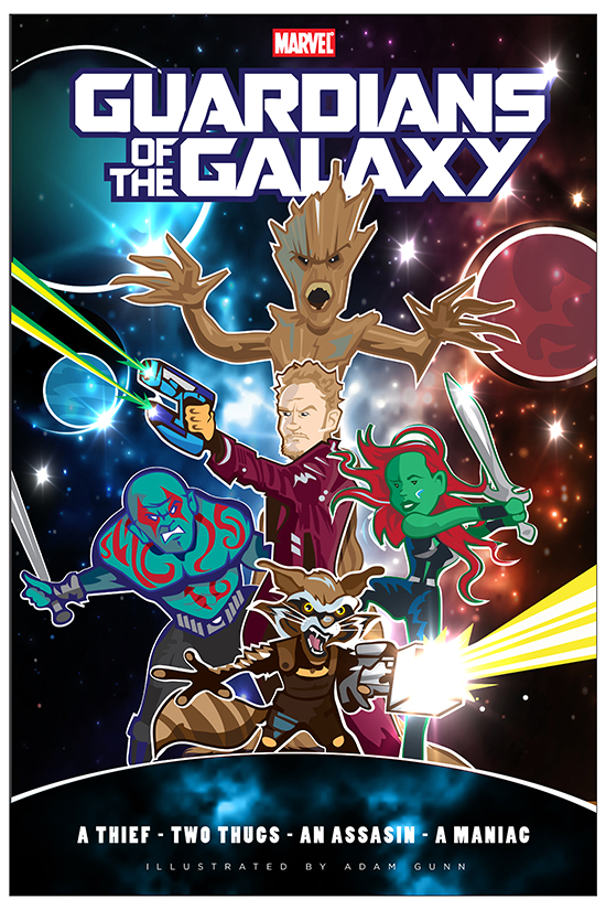
Guardians of the Galaxy Poster
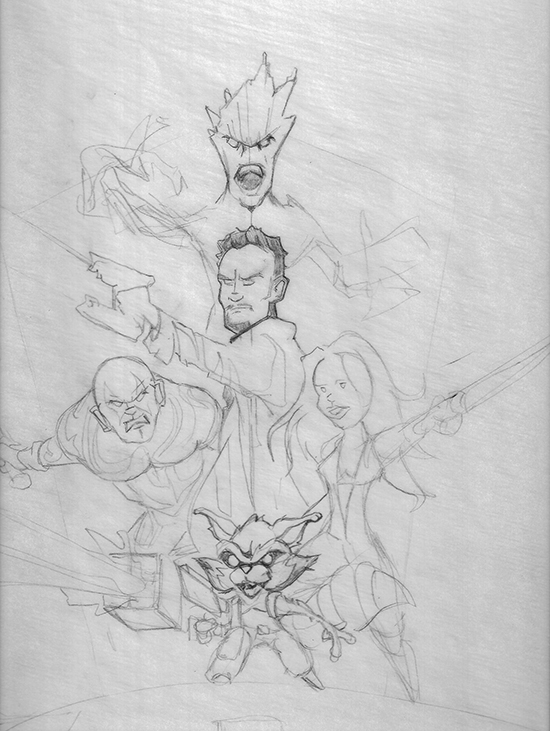
I enjoyed Marvel’s Guardians of the Galaxy movie more than I’ve enjoyed a movie in a very long time. I’m not one to watch movies multiple times but I’ve seen Guardians with my wife, co-workers and children and it’s remained both cinematically and thematically enjoyable each time. The characters are great and I’ve been enjoying all the fan posters posted online. I decided to create my own fan poster this week. below is the final with details and original pencil sketch. enjoy.
Charachter Close Ups
Original sketch
Customer is King Infographic
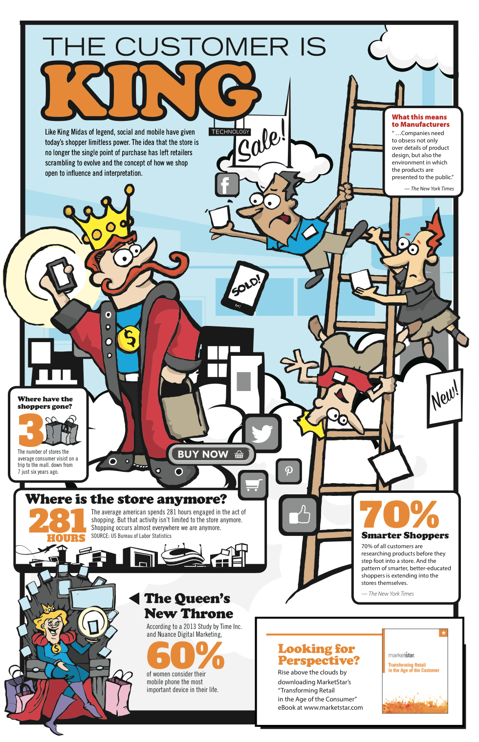
Concepted and Illustrated this fun Infographic to promote an ebook written by MakretStar’s EVP of Retail Strategy. It was a fun project. I have the privileged of working with a young intern right now, Aleesha Francis. She was instrumental in finalizing a lot of the elements in this piece. it was fun to collaborate with a young and talented artist.
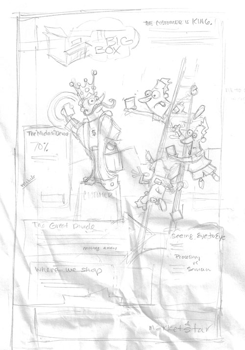
UPDATE>> I found a scan of the original concept sketch and added it to the post
Davis High One Act Play Poster
My brother is the stage manager at Davis High School. He asked me to help design a couple posters for their 2014 productions. My favorite was this poster for their one act play festival. Erik sent me a synopsis of each show and from that I tried to create a visual that was independently relevant and collectively consistent. It was a fun challenge and I was very pleased with the final result.
T-Shirt Design
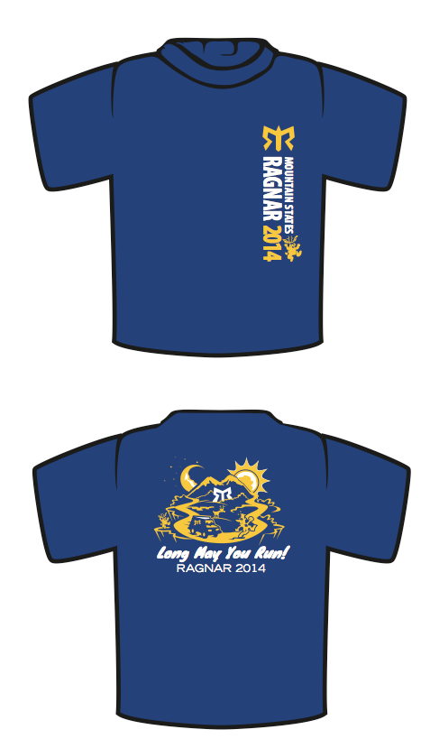
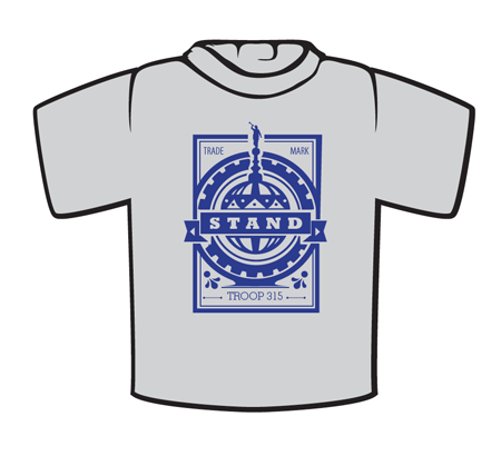
Inspired by the pop-culture styling of Shepard Fairey’s OBEY brand. this shirt was a commissioned piece for a church group in the area. If you look closely you’ll see a number of subtle icons that are easily identifiable for those of the Latter-Day Saint persuasion. Below are some sketches I presented with the selected idea in the center.
Here is how the final design turned out.
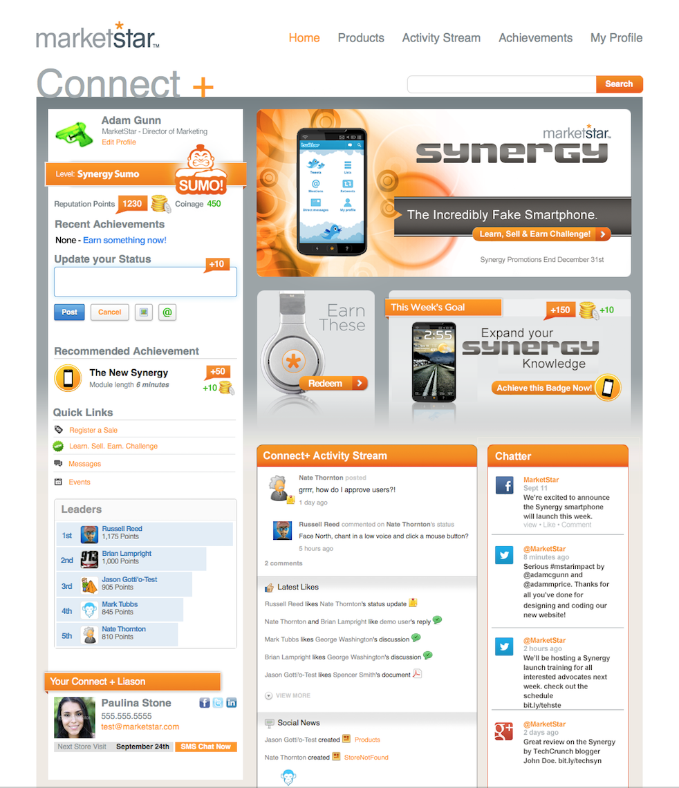
UI Design – MarketStar Connect+
I have a secret obsession very few people know about – UI/EX Design. I had the chance last year to design the original concept that the development team used to design our community platform Connect+. Our system is powered by the best enterprise community platform on the market Jive so you’ll probably recognize some of their terminology. At the time I designed this I didn’t have a lot of knowledge or experience with their platform or methodology but we’ve been able to strike a good balance between what we needed in the UI and the core social tools their software brings to the table. Experience design is critical to branding regardless of the platform so I’ve been a student of good web-design for a long time. Social has added a new layer to the equation and this was a great study in balancing the social functionality with the brand messaging.
Click image to enlarge
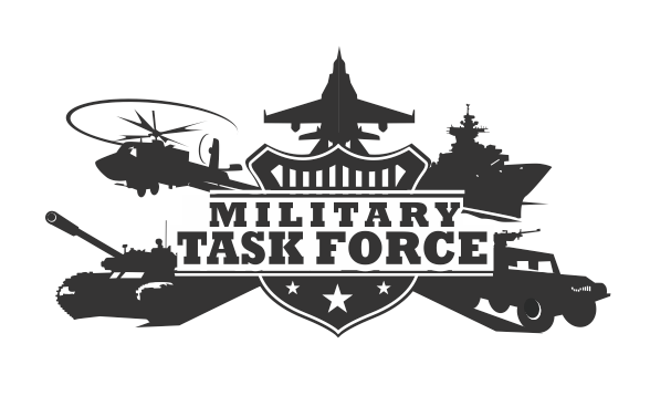
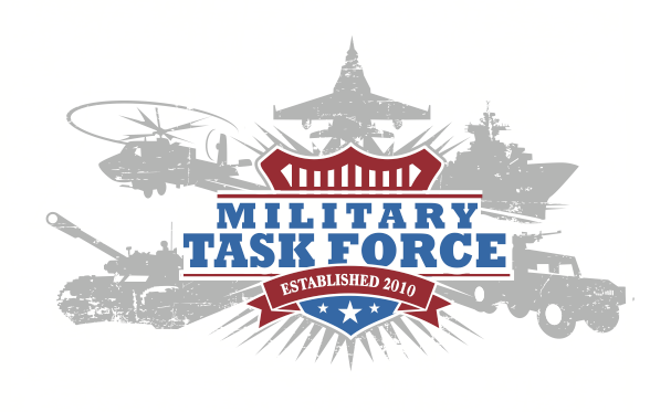
Davis County Military Task Force Logo
This logo was pretty heavily art directed but I liked how true to the original sketch I showed the client it turned out so I’m posting it as an example of concept to final.
Original Sketch (compiled from various source material)
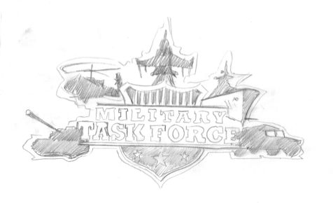
Vectorized version in black and white
Final Vectorized version in color
Logo Development: Ascend
This is a logo project I took on last year. As a charter school focused on an “enlightened journey” the client wanted something that elevated the education experience and conversations centered around a peak or mountain range. Living in Utah, I’ve done more mountain range logos than you can shake a fist at. Rather than just exploring the expected, My mind was drawn to a flag, like you would post after ascending Mt. Everest. In the end the final product became a hybrid of both ideas which came together quite well.
